Keeping it fresh

Fresh Thinking, New Energy, Every day.
Fresh Thinking, New Energy, Every Day. Since the beginning, these words have been at the core of the Day One brand, and while we’ve changed a lot over the last 6+ years, the ethos of what has made every day Day One for us has remained. We’re always looking to treat each morning like a new one, and to keep the spark of creativity you feel at the start of something new throughout each and every relationship.
Those ideals, paired with the idea of building something that will both last and have impact today, has allowed us to do some great work over the years, and in the end of 2019, we wanted to find some new ways to show off that work.
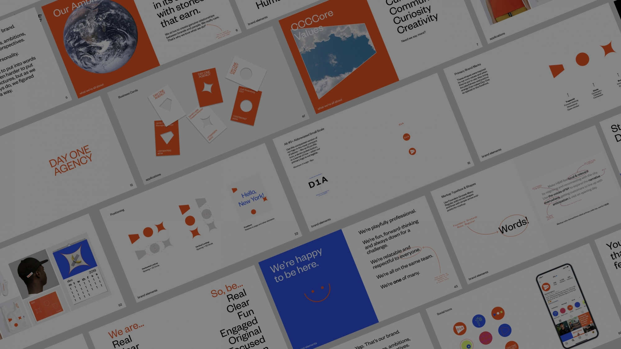
At the end of the first sprint, we found ourselves with some great new ideas around color and expression that matches our team’s energy, and some great references for what we wanted the new brand to do. From here we set some rules for the new branding:
For color it was important for us to keep the orange—it has been part of Day One since the beginning, but we added a few new colors to give our team some additional tools to play with and to express our vibrant energy.

And for our logo itself, we redrew Founders Grotesk into a new Day One Agency Lock Up with two iterations, a clean stack for all external communications, and an alternative 'flip' logo for internal. We love the way the capital G in agency creates almost a "refresh" mark right in the name. There is also a bonus, established in 2014 lockup, for the swag, flyers, and signage within the office space.

All of these pieces are now spelled out in our complete Day One brand book, and while we’ve made a lot of these for clients, it was truly the first time we put so much of our style on paper for the agency itself.
Translating to d1a.madeby.holiday
With the brand in place, we began the process of utilizing the new marks, type, colors, and expressions into an all new home for the agency. Back in 2016 I wrote a piece about agency sites and called it the “first point of contact, but the last consideration.” A lot of that holds true, and there is no greater sign than the fact that it took 3+ years for us to update once again.
This time around we had a lot of new ideas, and again some key rules:
We were extremely fortunate to partner with Richard Callahan of Holiday to lead the development. I’ve known Richard for years, and he was beyond helpful in seeing through the vision we presented in early designs. The new site is built on a more flexible CMS, and gives us an opportunity to not have to start from scratch the next time we need a small change or update.


